The screen simulation websites is one of the trend topics in online entertainment, simulations and digital creativity today. These are the best sites where you can create realistic looking screens like simulated desktop or mobile chats, loading screen, notifications, social media posts and app interface without downloading any software. They run directly in a browser, allowing you to access these games very quickly with minimum effort.
Their simplicity, convenience of no technical implementation, and what-if accessibility across all devices make these tools phenomenal among students and other netizens. Unpacking the ropes would mean examining web technologies, browser functionality, user interface design and backend processing systems that make these websites work without installation from installing them on an end users system.
Web Browsers in Simulator Websites :
Screen simulation websites usually have no installation because they run only from the web browser. Modern browsers like Chrome, Firefox or Safari are very capable and can run complex applications without requiring additional software.
A simulator website gets opened in the browser, and while that happens, the browser fetches each of a website file or portion and displays it to you. An HTML file for structure, a CSS file for design, and a JavaScript document for functionality. Collectively, these technologies make the website function with an app feeling even if nothing gets stored on the device.
Since browsers are available in almost every smartphone and computer, users can access simulator tools instantly. As a result, you can avoid downloading apps which saves storage space and reduces technical barriers.
Front-End Utilization (HTML, CSS & JavaScript)
Most of these screen simulation websites use just front-end technologies. These technologies govern the appearance and behavior of a website.
HTML (HyperText Markup Language) gives the content structure of the simulator, its chat boxes, buttons or notification areas. CSS (Cascading Style Sheets) is what you use to design the look of your website -- colors, fonts, spacing, and even animations. The simulator is interactive thanks to JavaScript, where the user can type text, click buttons and create simulated outputs.
HTML provides the building blocks as containers for web pages — in a chat simulator, this could mean typifying message boxes (chat bubbles), CSS makes them look like real messages while JavaScript adds interactive ability so that users can type messages and see them immediately on the screen. It can work as an actual application but only by using the website, no installation needed due to this combination.
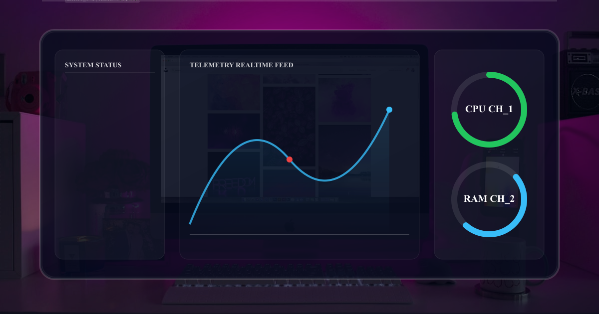
Real-Time Rendering in the Browser
A key feature of screen simulation websites is real-time rendering. Therefore, it simply refers that if a user inputs anything, the website reflects instantly on displaying something without reloading the page.
JavaScript is huge in this process. It listens for typing or clicking and immediately updates the screen. This results in a fluid experience that acts like you are even using a native mobile app.
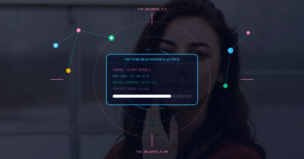
Template-Based Design System :
Template — a pre-defined layout that resembles a real application interface (imagine a chat app, phone screen or post on social media).
The basic approach is to have a 'template' and when the end user has filled in data, you replace it with what they entered on your website. Example: The template itself has the design of a notification box e.g. in blob to make a simulated notifications generator The user does not have to enter anything other than the text and it then is formatted correctly.
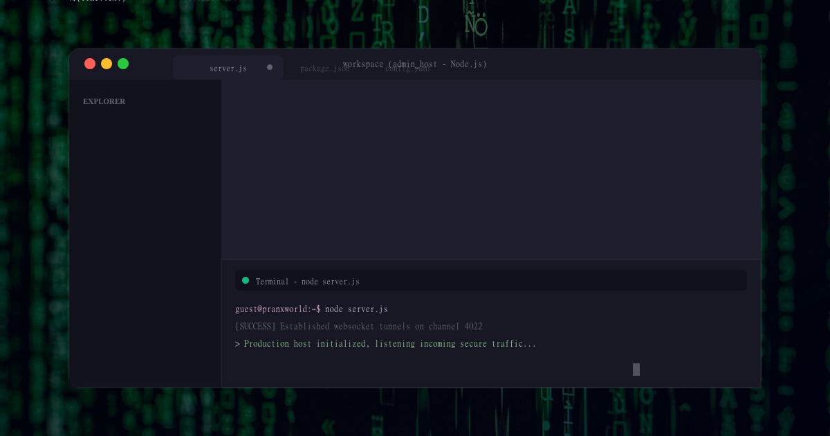
Client-Side Processing Without Installation
One of the main reasons these sites do not need a download is that almost all processing happens on the client side, right on their device in their browsers.
Instead of transmitting data to a strong server for processing, JavaScript does most jobs locally. And if a user makes a blank screen, the browser takes input and renders output as soon as possible.
This further minimizes heavy software or large installs. Also, it makes the website quicker and responsive. Because it all happens in the browser, and the fact that users can create and view simulated screens on low end devices.
Advanced features with minimal use of Backend
While the majority of simulated screens simulators work on the front end, some websites implement backend systems for extra features. Backend — is system parts that run on the server and provide data storage, user accounts or sharing options.
Let us take something simple for example, if you use a simulator that enables the user to save their work or generate links so it can be shared, this information is stored online on the backend. But even in these cases, the primary simulation takes place inside the browser.
Cross-Platform Compatibility
The third type of real screen simulation websites became famous because it is not limited to mobile / desktop or macOS / Windows systems. They are not dependent on the Windows, Android, or iOS-specific software as they run in browsers.
The website itself auto adjusts to suit the screen size, whether a user is on his/her smartphone, tablet or computer. These are implemented using CSS responsive web design techniques.
Lightweight file structure and fast loading
Simulated screens simulator sites are on the heavier side to open, and even slower with bad internet. Developers optimize images, scripts and stylesheets to decrease their file sizes.
Unlike traditional software applications, they will not have extensive installations; as soon as the website opens, it calls on particular features that are required. Thereby minimizing waiting time and enhancing user experience.
Browser Memory Usage vs Device Storage
Simulated screens simulating websites obviously do not occupy permanent storage on the users mobile since nothing is installed. Instead, they are stored in the browser memory while the website is open.
When a user closes the tab or the browser, all temporary data is erased. These tools are handy since they also save users from installing extra apps or utilizing device space.
This is one of the primary advantages of a web-based simulator design compared with traditional applications.
Security and Safe Usage Environment :
As screen simulation websites run in browsers they are much safer than downloaded software. Users do not have to download any unverified files nor grant access to system-level permissions.
However, safety is still on the website. As you get to know the best of simulator websites, they will not ask for much personal data and tempt you rather generate simulated screens. More browser control - since everything is running inside the browser, user holds more control over its device environment.
Cloud hosting and Internet access :
These websites are run via web servers, and live on the Internet. By means of cloud hosting they are now worldwide without the need for installing.
A user will hit the simulator website, and the browser makes a call to the server, pulls down those files and executes them locally. In particular, this system means that users always access the most up-to-date version of the tool without going through any update or download process.
With cloud hosting, developers can effortlessly maintain and upgrade the website, with all upgrades rapidly available to every user.
Conclusion
Screen simulation websites can be run without installation because they are made with strong web technologies that run in the browser based systems directly. The websites built with HTML, CSS and JavaScript make an interactive and realistic interface similar to the real apps and systems. With this ability, users can create simulated screens instantly without downloading any software since the system uses client-side processing, template-based design and real-time rendering.
Explore More Interactive Posts
Browse more digital simulation ideas, interface explainers, and browser-based entertainment guides across PranxWorld.
Read More Articles